Color can be tricky to master as a photographer, especially when working with both contrasting and vibrant colors. Understanding that the color you see may not necessarily translate to the captured shot is your first step. Working with tools, such as Lightroom, can help enhance the elements in your photograph and allow the colors to shine through vibrantly once identified.
Check out these 4 Free Quick Guides full of tips on how to work with color and make it work for you! Let’s go!
1. Complementary Color: The Insanely Powerful Photo Hack For Everyone
Complementary colors are one of the photographer’s super tools when it comes to garnering audience attention. Why? Complementary colors react on a primal level within our brains. We can’t turn it off! By including complementary colors in your photos, it’s like secretly adding superglue for the eyes! Oftentimes, the colors chosen in a photograph are what draws our eyes and attention, the way they complement one another allows for powerful story play to ensue. Download here →
2. Lightroom: Color Adjustments (Featuring Travel Photography)
Managing the color in your digital photography is a critical skill. How do you accurately capture an umbrella’s bright red color while maintaining proper skin tones on the woman holding it? There’s another added element to the mix when you start looking at how tones and color translate from your eye to the camera. A bright, effervescent color to the eye can result in a duller than life photograph and we ask ourselves how? This is where Lightroom becomes your best friend. Having the ability to enhance the once vibrant color in your photo brings back to life that incredible scene you once witnessed. Download here to learn more →
3. Vibrant Colors
When shooting vibrant colors, we must understand that not all colors and tones will translate from our eye to the captured image. We must also understand that when dealing with vibrant colors we must know about complementary coloring and how choosing the right shades in your image can have a drastic impact on the outcome. Ready to learn more? Download here →
4. How To Use Spot Color In Your Photographs
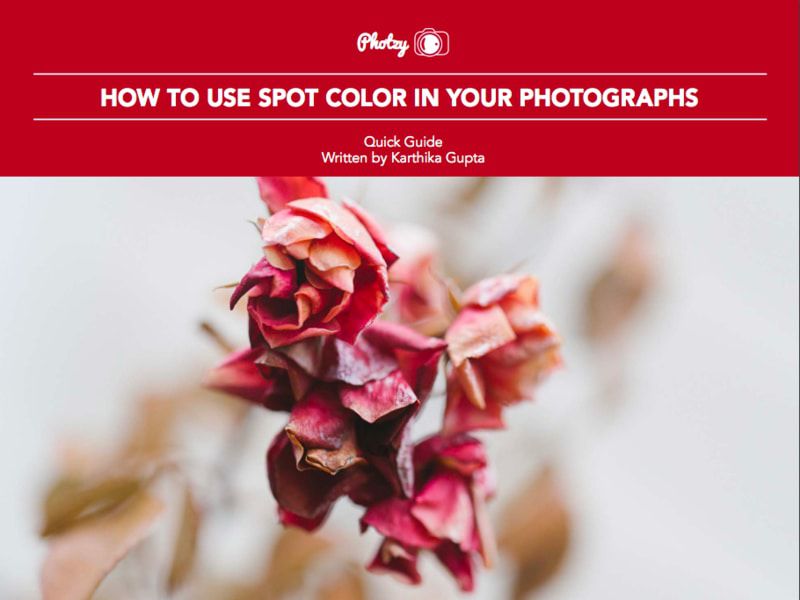
Do you know the difference between the use of spot color and selective color? Did you know there was a difference? Well, there is! And, while selective color is somewhat of a niche and may be a bit cliche, spot color is a very useful tool of composition that has been around since the beginning of color photography. Spot Color allows you to center your photo around one defining color, which in turn allows itself to shine and grab the attention of the viewer. Interested in trying it out? Download here →
Recommended Resources
We hope these guides have whet your appetite on using color effectively in your photography! But if you were looking to practice and learn more about how to create rich and vibrant color photography, then check out Photzy’s Premium Guide on the topic here. Use this eBook to uncover the secrets behind creating a memorable, fascinating and engaging color photograph. This guide will help you to understand the relationship of color and light, how to use this to your advantage to evoke emotion and how this can help your storytelling too. Read more about Creating Rich and Vibrant Color Photography Volume 1 here.